Note: If you would like to skip to our final prototype, you can go to HERE.
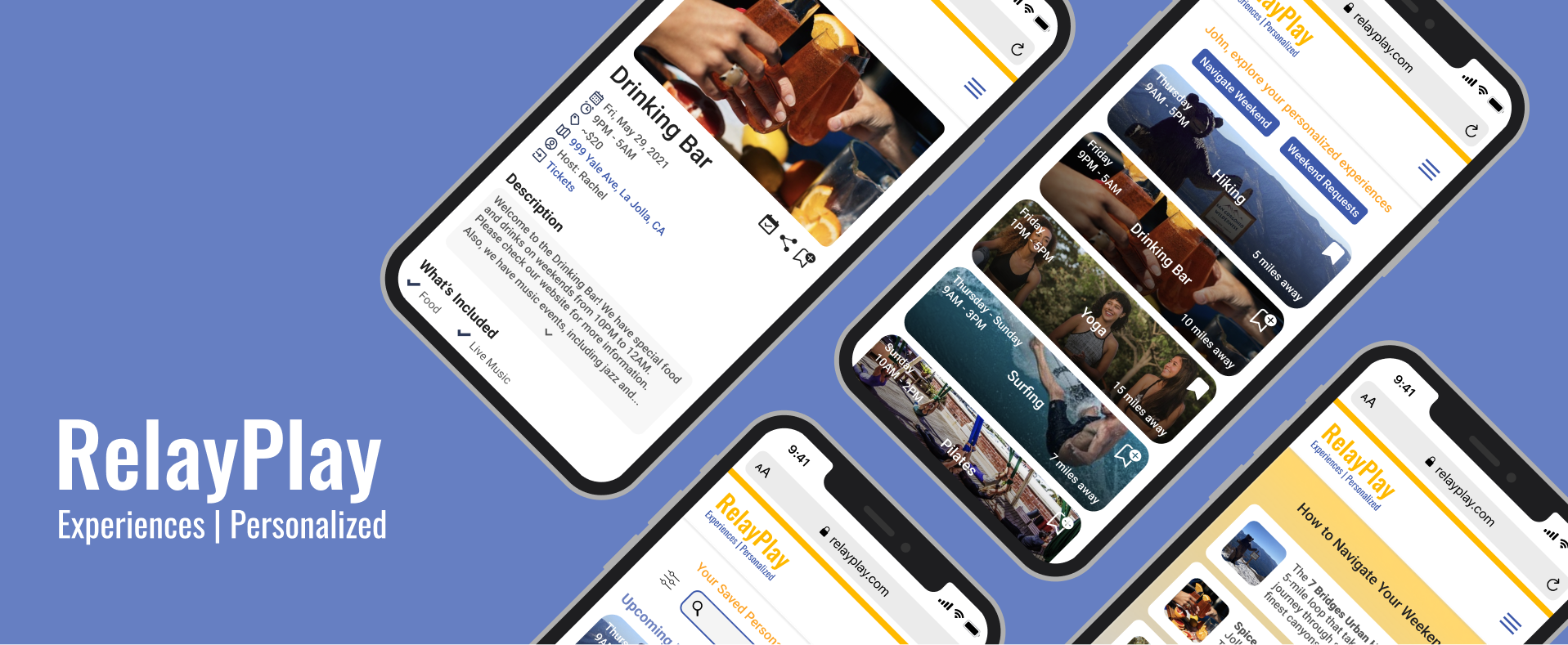
WHAT IS RELAYPLAY?
RelayPlay is a platform that provides users with their top five personalized experiences each weekend created for them by local experts, as well as extra generalized experiences in the area.
PROJECT OVERVIEW
Date: April 2021 to June 2021
Collaborators: Haeun (Madison) Kim, Vanessa (Nessi) Komar, Jessie Lin, and Lu Zhang
Focus: UX/UI Design, Visual Design
Tools: Figma
USER RESEARCH
We created our own survey to send out but we were also able to see some feedback from previous user research that RelayPlay conducted. Thus, these are what we found out:
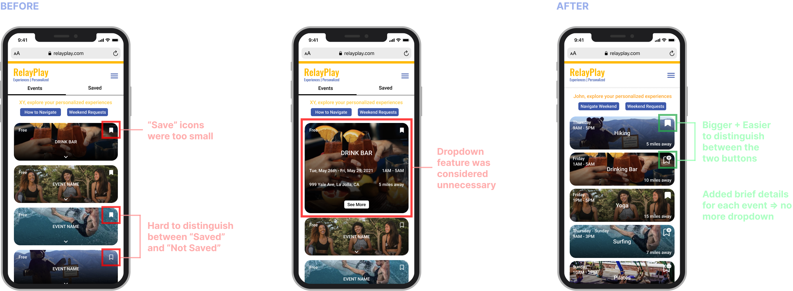
1. Too much scrolling wthin one page
2. Too much information about experience coordinator
3. Not being able to save/look back at old experiences
4. Lack of clarity at how to sign up for the events
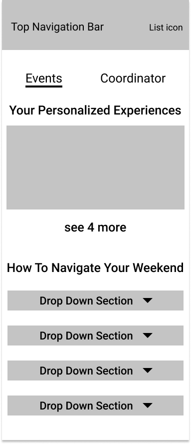
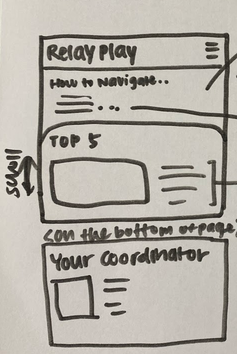
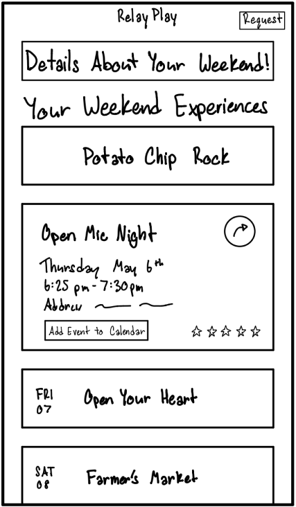
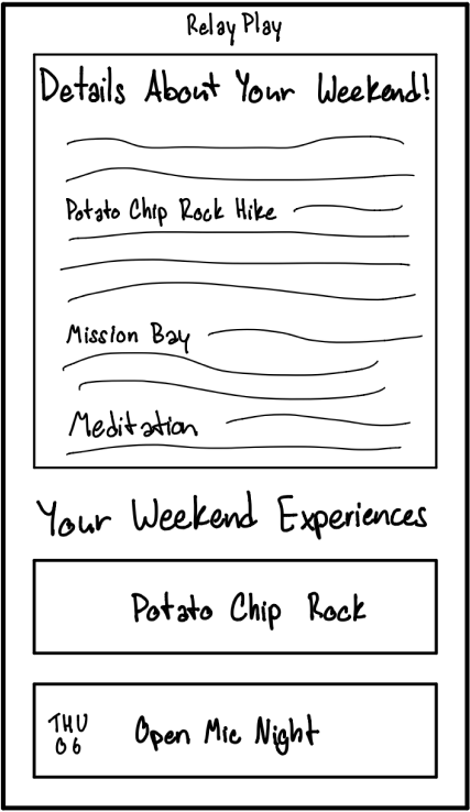
As we can see the original screen, there is too much information on one page. It has many sections including "experience coordinator", "weekend request", "top 5 experiences", and "how to navigate". So, it is challenging for people to navigate and utilize the features that RelayPlay offers.
PROBLEM STATEMENT
How might we design a mobile/home page that is more informative and user friendly?
USER PERSONAS

Amy Potter (21)
Wants/Needs
Wants to find places to have fun with her friends.
Can’t spend too much time on researching so she uses an app/website to search for experiences.
Frustrations
RelayPlay’s layout of experiences confuses her and is often hard to approach due to the website’s disorganization.

Nathan Greer (32)
Wants/Needs
Wishes to find new places to have fun in with his co-workers and friends.
Wants to find events that fit his interests and likes. He wished he had recommendations from people who are knowledgeable with this area.
Frustrations
RelayPlay’s current “how to navigate” page is hard to find and the personalized page is confusing due to the expert’s profile page.
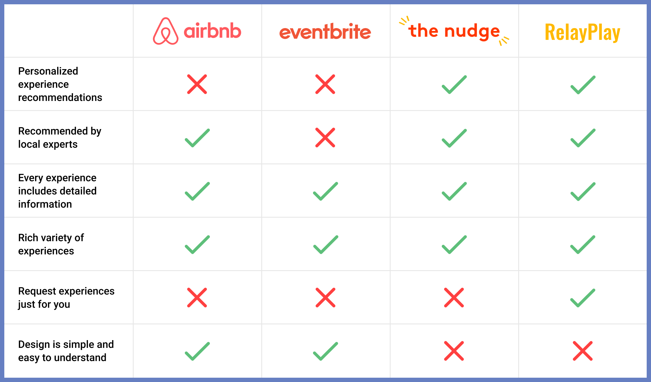
COMPETITIVE AUDIT
While RelayPlay has similar features to other competitors, what makes it unique is that users can request experiences based on their preferences. However, it needs to be more simple and easy for users to navigate and use.
INITIAL WIREFRAMES
In order to have different possibilities for layouts, each member of our team created the wireframes separately.
My Wireframes
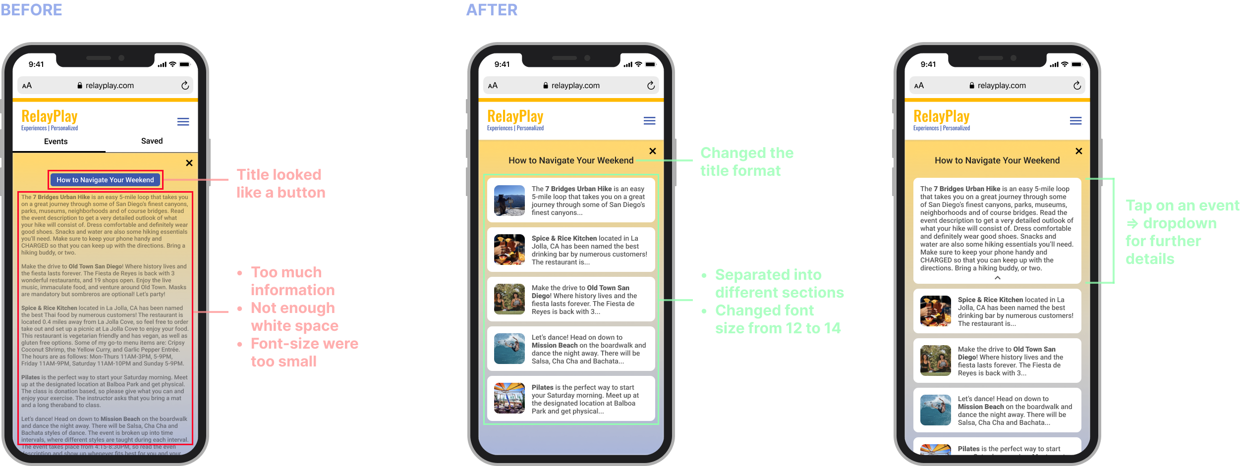
As I mentioned above, there is too much scrolling on one page. Thus, I separated it into different pages. I also added dropdown sections, so people can see more details when necessary.
Other Wireframes
There are also wireframes from my teammates that you can see below.
FINAL WIREFRAMES
After creating different screens by individuals, we discussed with each other to see the best layouts that we had. Then, we combined the features that we had as you can see the final wireframes below. We will get more details about the features when we go through the high fidelity prototype.
HI-FI MOCKUPS (INITIAL)
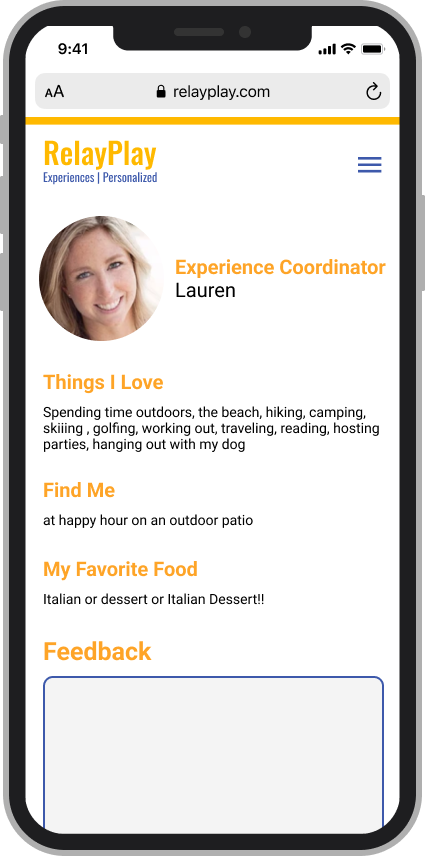
With the branding colors and pictures from the website, we built on our hi-fi prototype after the wireframes. This prototype would allow us to create a realistic experience encouraging helpful feedback from usability testing.
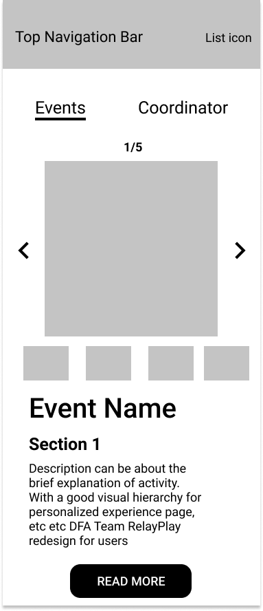
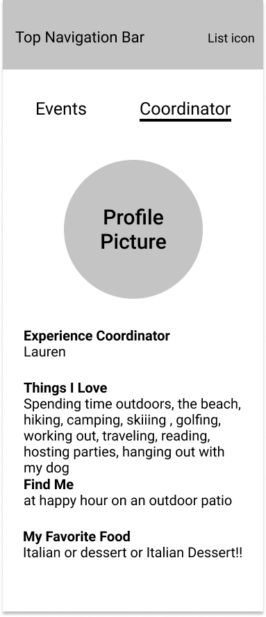
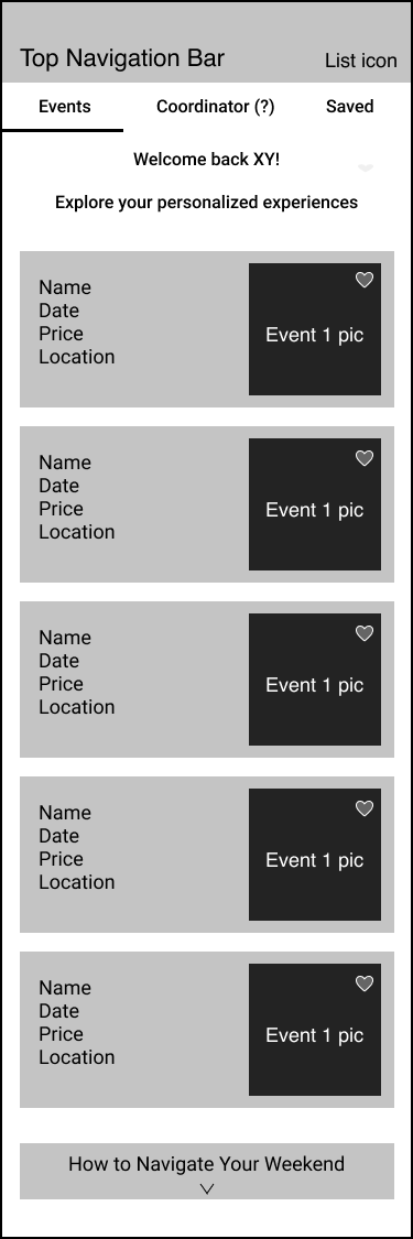
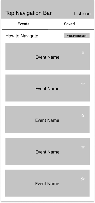
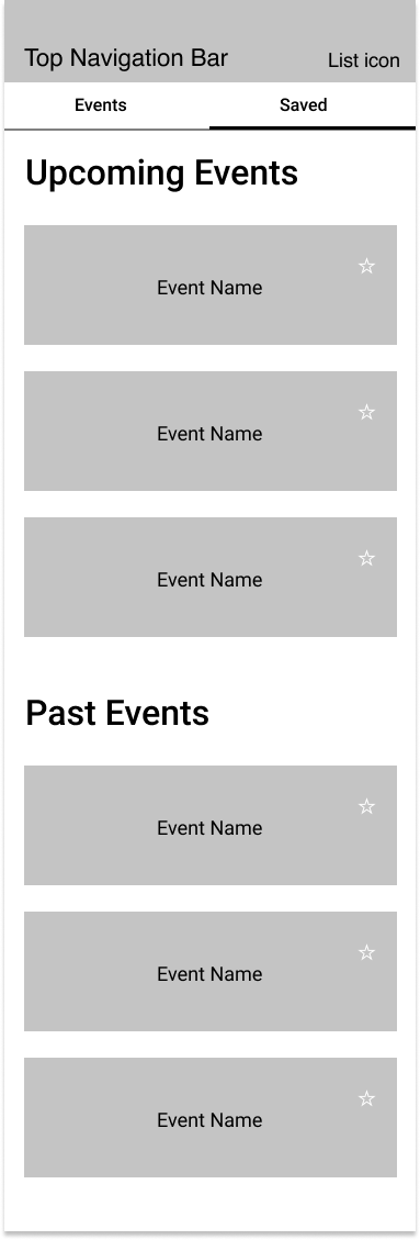
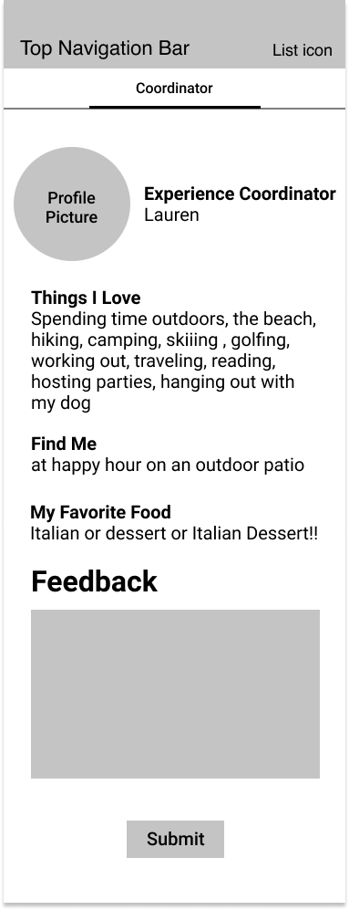
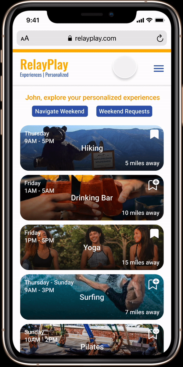
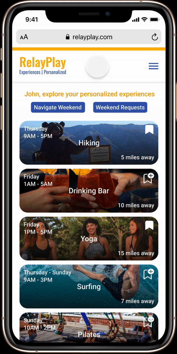
As I mentioned above, there is too much information on one page. Therefore, our team separated the sections "experience coordinator", "weekend request", "top 5 experiences", and "how to navigate" into different pages.
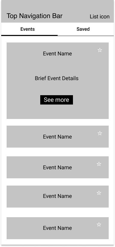
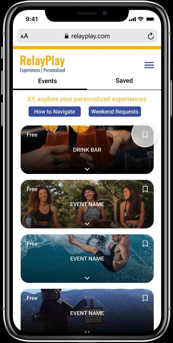
We also adjusted the "top 5 experiences" page to make it more accessible, as you can see the 2 gifs below.
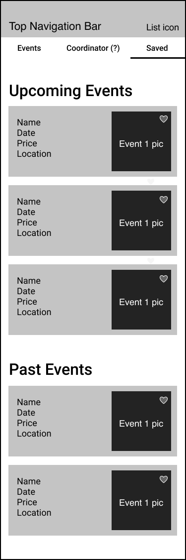
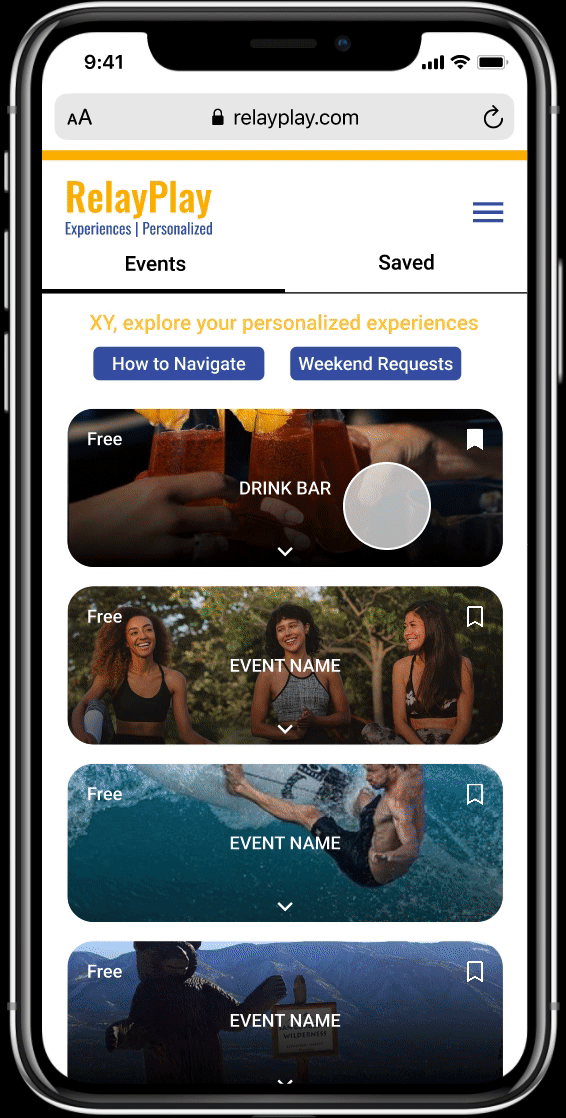
Save Events
Users can save events by clicking on the save button in each event card. Then, if they want to take a look at the events they saved earlier, they can simply go to the "Saved" section for these saved events.
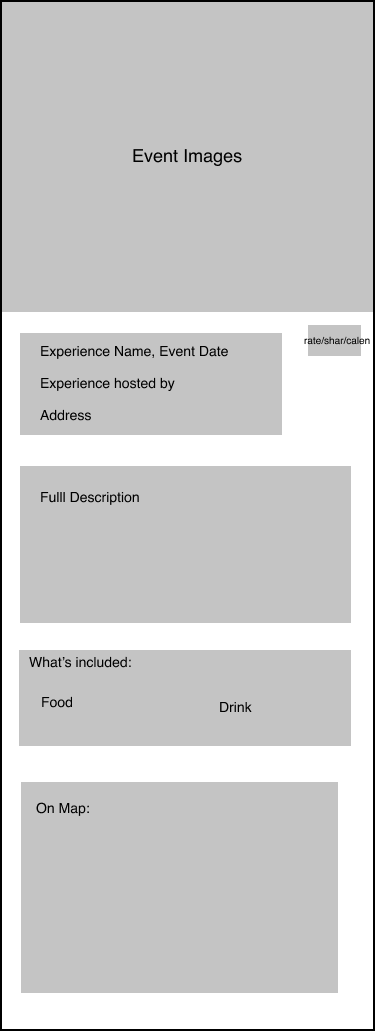
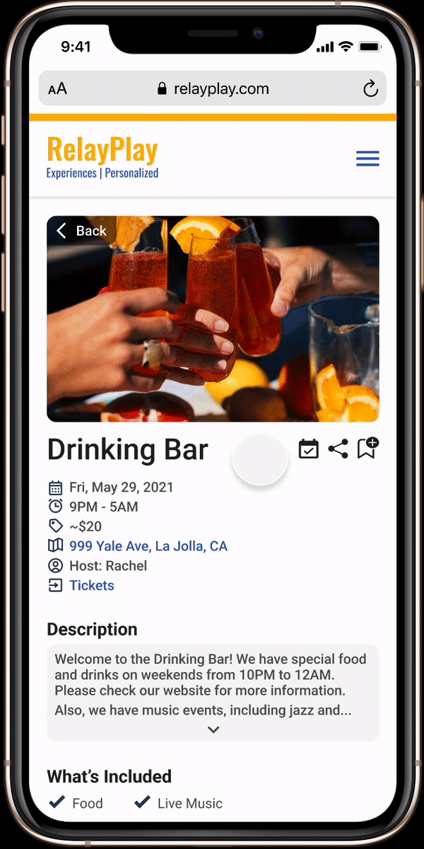
Event Details
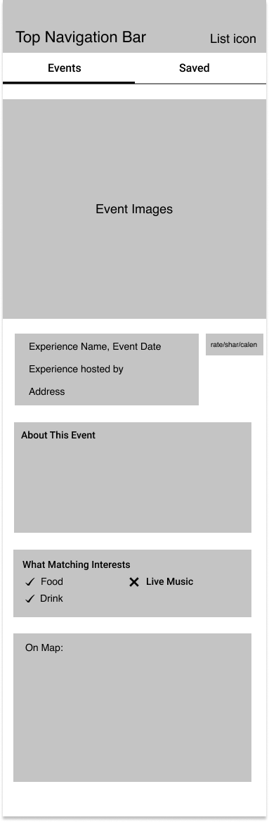
When users click on an event, it drops down and shows a few details about the event. It also has a "See More" button allowing them to go to a separate page for that event with all details.
USABILITY TESTING
We conducted usability testing with 10 participants to identify where we could improve our prototypes.
9/10
said that the prototype was good overall
6/10
thought that the prototype was easy to navigate
4/10
got confused when trying to save an event
7/10
got confused when accessing the “How to navigate your weekend” section
ITERATIONS
Events
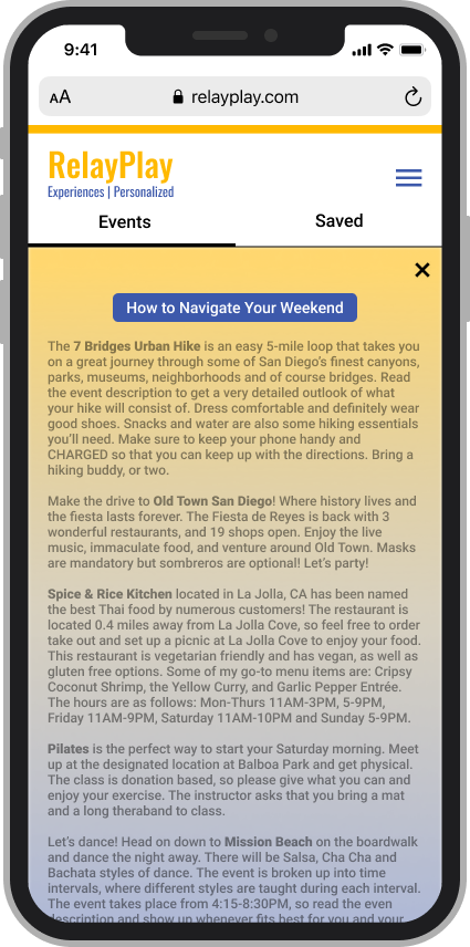
"How to Navigate Your Weekend" Page
Other Iterations

Menu Navigation
We added the menu navigation for the iteration, and this is where users go between different sections.
Saved Events
Instead of the switch button on the "Personalized Experiences" page, users can go and check these saved events through the menu navigation. Moreover, we slightly adjusted the "Saved Events" page by adding search bar and filtering function.
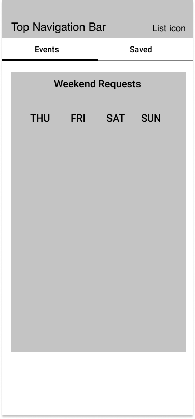
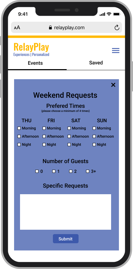
Weekend Requests
This is where users can request additional experiences to fit their needs and preferences. Also, this page has bigger font size for better accessibility compared to the last design.
Experience Coordinator
Since some participants let us know that the "Experience Coordinator" was not really important, we decided to put it in a section on an event page ("Drinking Bar", for example) instead of having a whole separate page for convenience.
FINAL DELIVERABLE
Here is our design after the iterations. Enjoy exploring around the prototype! :)
NEXT STEPS
If we continue this project, we would like to have more usability tests and user research. So, we would be able to further iterate the platform. We also would like to collaborate with developers when they work on implementing our design.
LEARNINGS
1. Feedback matters
No matter how experienced we are, there are always aspects and details to improve, which we might not notice. This is why it’s always good to have usability tests for feedback and iterations.
2. Prioritize collaborating more
We didn't have enough opportunity to collaborate with co-founders and developers due to time limit and scheduling conflicts. Thus, we learn that we would prioritize it for our next projects, so we can communicate, learn from different perspectives, and know more details about what to improve.
If you're interested in, feel free to check out one of my other projects below: